Mobile and tablet
One view at a time
Below about 1100 px width, ASTROLAB Web uses a compact layout. There is no three-column IDE. The menu (hamburger) switches the primary view. Widen the window and the desktop layout returns — there is no separate mobile site.
Open Web App · wide layout: Interface tour
Menu
- 3D scene — globe or map and playback
- Reporting — Dashboard plots and tables
- Edit assets — Mission Tree or Properties
- Engineering Portal — account and cloud library
- Mission file actions (new, open, save, export) as shown in the drawer
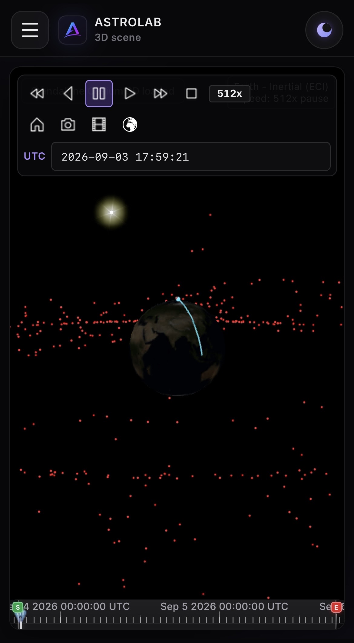
Phone — 3D scene with playback and menu.
Touch
| Instead of… | Use |
|---|---|
| Right-click on the tree | ⋯ on the row (add, remove, run) |
| Properties that “will not scroll” | Scroll the Assets pane; the form moves with it |
| Generate far below the templates | Generate stays at the top; the view jumps to the result |
Prefer landscape for the globe. Keep scenario windows short on a phone so playback and analyses stay light.